
Mary Ann is an international business coach who works with teams of executives all over the world. She wanted a visual brand that would reflect her and her core values.
The problem
Mary Ann had no visual representation of what she was about as a business. There was no consistent messaging / imagery in any of her materials that would support her brand. She wasn’t communicating from a brand space or message.
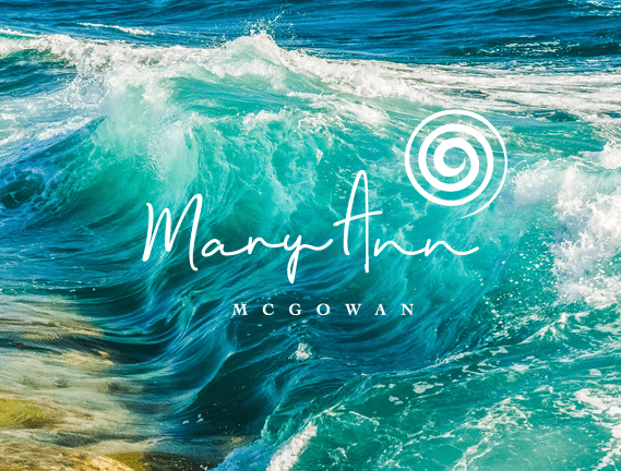
Image courtesy of Mary Ann McGowan
DESIGN SOLUTION
BRAND STORY
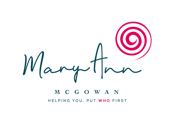
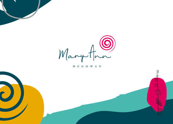
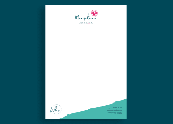
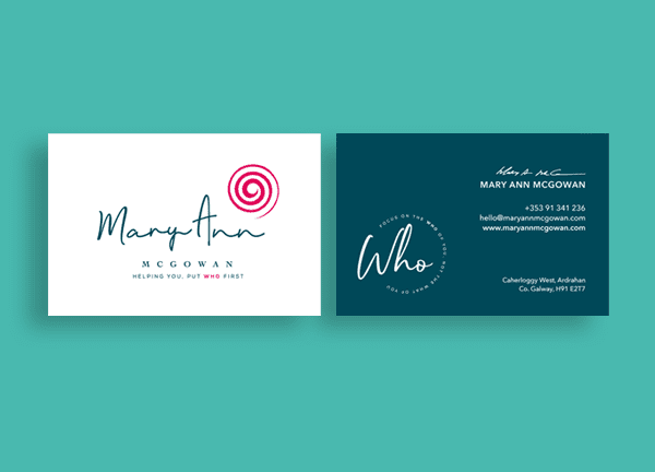
Treetop Studio created a spiral symbol for Mary Ann, the spiral symbolises creation, self-realisation, expansion of consciousness, perseverance and knowledge.
The energy around this is growth, self actualisation, connectivity with the cosmic universe and creativity. It reflects the universal pattern of growth and evolution. It represents the inward and outward evolution, a balanced and centered state of mind.
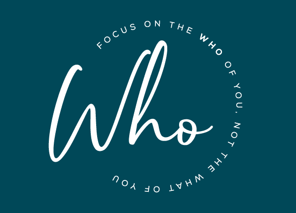
On water, it carries the power of flow and change. The spiral represents the ‘who’. The meaning here is twofold as it represents Mary Ann and also the people she works with. The brand reflects Mary Ann’s personality & her love of water & nature. Every element represents Mary Ann.