

Leo Dolan is a lifestyle photographer with a passion for capturing images that families can cherish for years.
The problem
Leo had been a photographer for a number of years without any real identity. The only way a client could get to understand his values and what to expect from him, came from face to face meetings. This method was effective but not very time efficient. Leo needed a visual brand that would make a good first impression, show a level of consideration and professionalism that would represent him in a strong and capable light.
Image courtesy of Leo Dolan.
DESIGN SOLUTION
BRAND STORY

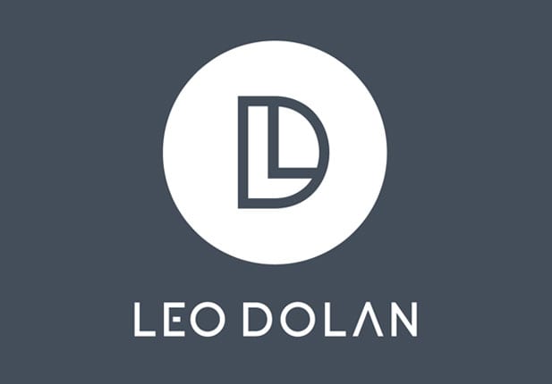
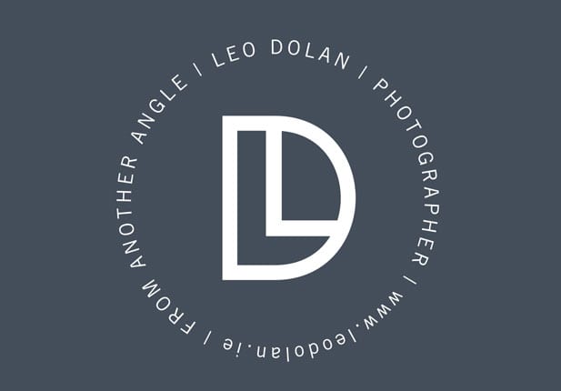
The primary concept behind Leo’s visual brand is that there is a deeper meaning to the way he works. This strong, contemporary symbol is made up of his initials ‘LD’. Again, this is playing on the idea, that there is more to something.
We can read images or symbols instantly, but if we look a little closer, we can appreciate these other elements, that we may previously have overlooked. This symbol represents Leo and the way that he can look at things differently, create a composition from another angle. Not the standard, run of the mill image.
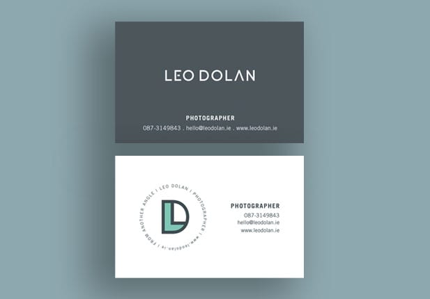
Treetop Studio created a main brand identity for Leo with additional sub mark and tag line, visual brand elements and brand guidelines. All these elements help to create a complete, consistent brand and strong brand story.