

Melanie Ardiff of Hawthorn Studio based in Dunboyne, Co. Meath offers yoga, reiki and a range of other holistic offerings.
The problem
Melanie saw what other businesses within the same sector were doing and didn’t want her visual branding to be the same as this. She really wanted her branding to reflect the vision for her business and also to reflect her personality.
Melanie had a couple of requirements, she needed guidance on the actual name of her new venture and the creation of a complete visual brand for her new business. She needed a name that would allow space for her venture to grow. She knew she would be doing ongoing trainings to add to her skillset and would then use these new learnings to add to her holistic offerings in the future.
Image courtesy of Melanie Ardiff.
DESIGN SOLUTION


BRAND STORY
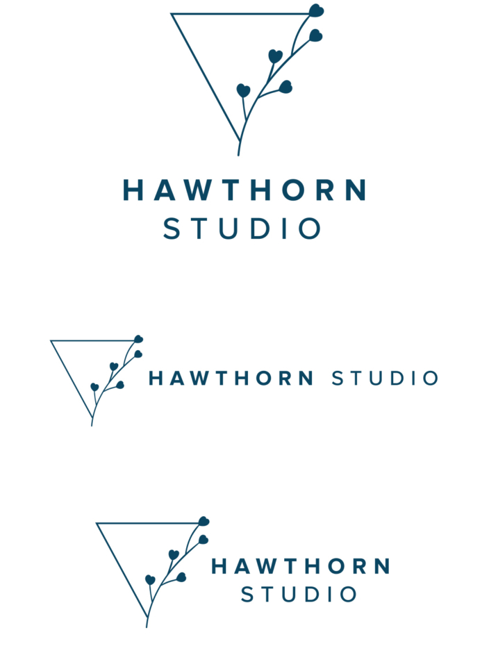
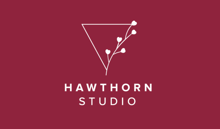
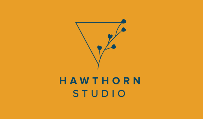
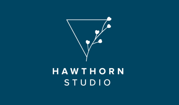
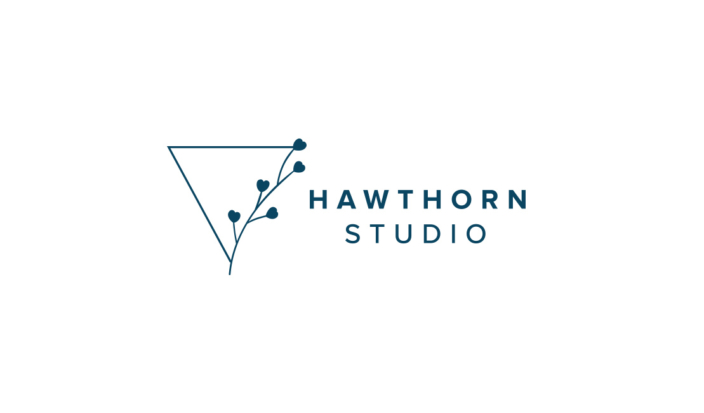
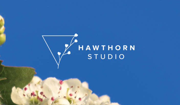
The Hawthorn is known as the tree of the heart as it has healing powers both medicinally and spiritually. The lovehearts on the branches in place of flowers symbolise this concept. The upturned triangle represents feminine energy.
The process started off with a discovery session between myself (Aisling) and Melanie. We delved into her story, the vision for her business, her customer and so much more. Following that I developed a moodboard for the visual brand, so that Melanie had an idea of the direction and style I was leaning towards. Once that moodboard was discussed in detail, I then moved onto the actual designing stage. I presented Melanie with two options and two different concepts behind each of the options.
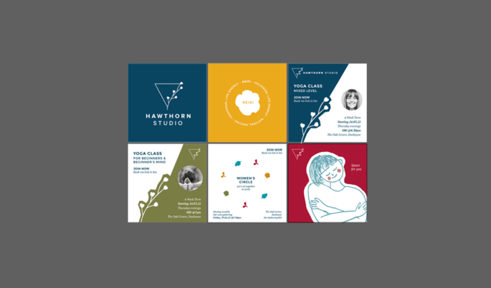
Melanie knew that she would be relying heavily on Instagram to promote her new business, therefore she wanted templates for Instagram that she could edit and add to as needed. A visual style guide for instagram was created, along with extensive brand guidelines so that her branding would remain consistent and on brand.
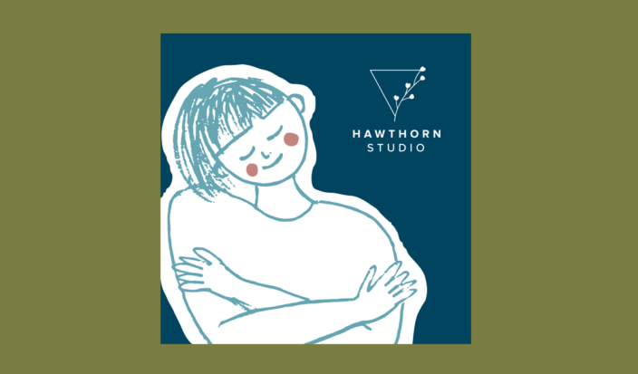
Treetop Studio created a family of logos for Hawthorn Studio, giving her visual brand flexibility and a professional look. A visual language for the brand was developed through the creation of bold patterns and icons. An organic, free flowing illustrative style was created as a contrast to the more angular and geometric brand elements. The result is a strong, unique visual brand that represents Melanie, one that she is truly proud of and speaks to her customer.