Clara Whitaker is a Career Doctor. She helps international executives who struggle with frustration and burnout in their jobs. She helps them figure things out and puts them on the right path.
The problem
Clara had some branding in place, but it was not representing her and how she works with her clients. She didn’t know how to simplify her message and was feeling overwhelmed as she wanted to say so much. She needed someone to simplify her message and create a visual brand that reflected this.
Image courtesy of Clara Whitaker.
DESIGN SOLUTION
BRAND STORY

The primary meaning behind Clara’s visual brand is freedom. This is represented through the silhouette of the free flying bird. Clara works with her clients in a raw, organic method, stripping back the layers, to get to the essence of what they are about. She gives them their freedom back by putting them on the right path in their career.
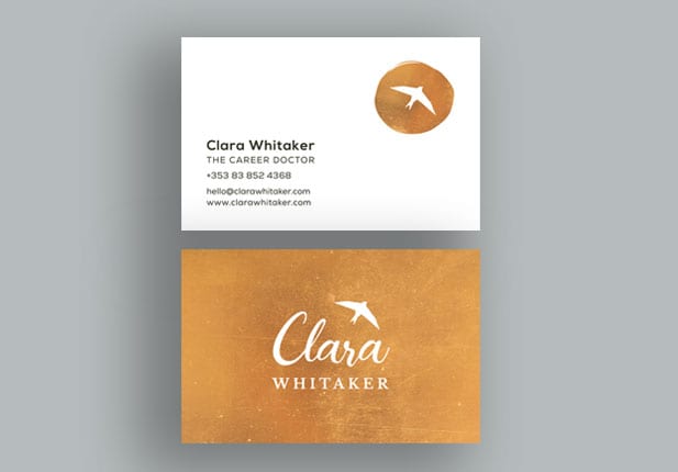
Treetop Studio created a main brand identity, sub mark, brand elements (expressive brushstrokes) and brand guidelines for Clara which creates a complete and considered visual brand look.

